Category: Data

  • How I Developed a Next Word Prediction App for My Capstone Project

    How I Developed a Next Word Prediction App for My Capstone Project

    Last month, on Sept 10th, I finally finished the Capstone project for the tenth course of the Coursera Data Science Specialization. I had been staying up for more than four nights in a row, the latest to the second day at 5:30 am. I don’t remember when was last time I had done this since I graduated from my Ph.D. study.

    I remember fighting one after another challenges during this project. For so many times, I felt that I might just not have the character to be a data scientist. I had made so many mistakes during the process, yet those were also how I learned. Bit by bit, I kept correcting, tweaking, and improving my program.

    At one point, I thought I had a final product. Then I found that someone on the course forum had provided a benchmark program which can help test how well your app perform. Yet the process to plug in your own program to do the test itself was quite a bit of challenge.

    In the end, I saw a lot of other assignments which didn’t even bother to do it. However, plugging in my app into this benchmark program forced me to compare my app’s performance to others, which in turn forced me to keep improving and debugging.

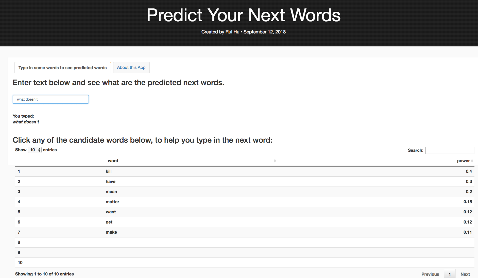
    At the end, the result was satisfying: I created my own predict the next word app, and I am quite satisfied in comparison to the peers’ works that I have seen during the peer assignment reviewing:

    https://maggiehu.shinyapps.io/NextWords/

    My app provides not only the top candidates for next word prediction, but also provides the weight of each candidate, using the Stupid Backoff method. I also tried to model after the cellphone text type prediction function, which allows the user to click on the preferred candidate to auto-fill the text box. Below is a screenshot of the predicted top candidate words, when you type in “what doesn’t” in the text box.

    And here is the accompanied R presentation (The R Studio Presenter program implements very clumsy CSS styles which took me additional two hours, after the long marathon of debugging and tweaking the app itself. So I really wish that the course had not had this specific requirement of using R Studio Presenter for the course presentation.

  • Factors Influencing Higher Ed Professional Development Participation – Part I

    Factors Influencing Higher Ed Professional Development Participation – Part I

    Like all tier-1 research universities, our institution has over 60 K students, 20k employees including teaching and research faculty, staff, part-time and temp. Over the years, multiple platforms have been adopted by various campus units to keep track on different sorts of employees’ data. Therefore it can be a little challenge when it comes to integrate data from different platforms about employees’ background info, like gender, years of service, position type, with data about their participation of professional development courses on campus.
    I chose to use R to import the .csv files from two different data systems, and then reformat and combine them, to get an integrated data table for my analysis.

    First we got the data from our training website. These data include two types: course participants only from the year of 2015 to 2017; and all employees on record from 2015 to 2017.

    The first type data include: first name, last name, email address, department, course session, participate status (attended, cancel, and late cancel), course session date.

    The second data include: First Name, Last Name, SupervisorInd (0 for non supervisory, 1 for supervisory). However, there is no department information in this data.

    By merging two types data, I got my first version of the “final” table, including: full name, department, supervisoryInd, participation status (Y/N), and number of courses participated.

    However, I want to know if the following factors would affect the participation status and the number of courses participated: gender, year of service, departments, type(staff, academic faculty, research faculty, adjunct faculty, tech temp,etc.), and full/part-time.

    So I reached out to the admin of the campus employee record system. They kindly provided the data of employ who started within the years of 2015- 2017 with first time, last name, gender, type, full/part-time, departments, and they were very kind to compute the years of service as well.

    From there I was able to create my second version of the final data table:

  • Coursera Data Science Specialization Capstone course learning journal 4 – Tokenize the Corpus

    Coursera Data Science Specialization Capstone course learning journal 4 – Tokenize the Corpus

    When it comes to text analysis, a lot of articles would recommend clean the texts before moving forward, such as removing punctuation, lower letters, removing stop words, white space, removing numbers, etc. In the tm() package, all these can be done with function tm_map(). However, because quanteda’s philosophy is to keep the original corpus intact. All these have to be done during the step of tokenization.

    Good news is, qunteda’s tokens() function can do all above with a few extra, except that it can’t do remove stop words.

    system.time(tokenized_txt<-tokens(final_corpus_sample,remove_numbers = TRUE, remove_punct = TRUE, remove_separators = TRUE,remove_symbols=TRUE, remove_twitter=TRUE,remove_url = TRUE))

    But then I found that you can use tokens_select() to remove the stopwords:

    nostop_toks <- tokens_select(tokenized_txt, stopwords('en'), selection = 'remove')

    After that, I built 2-6 grams:

    system.time(tokens_2gram<-tokens_ngrams(nostop_toks,n=2))
    system.time(tokens_3gram<-tokens_ngrams(nostop_toks,n=3))
    system.time(tokens_4gram<-tokens_ngrams(nostop_toks,n=4))
    system.time(tokens_5gram<-tokens_ngrams(nostop_toks,n=5))
    system.time(tokens_6gram<-tokens_ngrams(nostop_toks,n=6))

    The corresponding system.time are as following:


  • Coursera Data Science Specialization Capstone course learning journal 3 – Ploting text file features

    Coursera Data Science Specialization Capstone course learning journal 3 – Ploting text file features

    Last journal talked about how to get general txt files features such as size, line, word and char counts. This journal will record my learning journey of ploting the features. See below:

    > textStats
    Type File.Size Lines Total.Words Total.Chars

    1 Blog 209260816 899288 42840147 207723792
    2 News 204801736 1010242 39918314 204233400
    3 Twitter 164745064 2360148 36719645 164456178

    I have used ggplot2() and plotly() before, but it has been several months. Plus I wasn’t an expert back then for both of them. So this time it took me quite a few hours to figure out the right way to do it.

    I first started charing with ggplot2(). Soon I found that normal ggplot2() bar chart wouldn’t let me chart all four features for the three types of files side by side. I searched around, and found people say that, in order to create bar chart side by side using ggplot2(), you will first have to use reshape() to switch the data.frame’s rows and columns, and add a new column called “id.vars,” I realized this was what I have learned in the previous Coursera courses after reading this. So here it is the try;

    library(reshape2)

    textStats_1<-melt(textStats,id.vars = ‘Type’)

    and here is the new data.frame:

    > textStats_1
    Type variable value
    1 Blog File.Size 209260816
    2 News File.Size 204801736
    3 Twitter File.Size 164745064
    4 Blog Lines 899288
    5 News Lines 1010242
    6 Twitter Lines 2360148
    7 Blog Total.Words 42840147
    8 News Total.Words 39918314
    9 Twitter Total.Words 36719645
    10 Blog Total.Chars 207723792
    11 News Total.Chars 204233400
    12 Twitter Total.Chars 164456178

    Then plot:

    library(ggplot2)

    q<-ggplot(textStats_1, aes(x=Type, y=value, fill=variable)) +
    geom_bar(stat='identity', position='dodge')

    q


    Now I realize that I need to find a way to have file size, word counts and char counts shown as 100s or 1000s. I am sure ggplot2() has someway to do this, however, a quick google search didn’t yield any immediate solution. I knew that I had seen something like this in plotly(). So I switched to Plotly().

    And here it is:

    library(plotly)
    p <- plot_ly(textStats, x = ~Type, y = ~File.Size/100, type = 'bar', name = 'File Size in 100Mb') %>%
    add_trace(y = ~Lines, name = 'Number of Lines') %>%
    add_trace(y = ~Total.Words/100, name = 'Number of Words in 100') %>%
    add_trace(y = ~Total.Chars/100, name = 'Number of Chars in 100') %>%
    layout(yaxis = list(title = 'Count'), barmode = 'group')

    p

    There was no need to “reshape()”. Plus you can directly calculate within the plot. Also it has this built-in hover over text function. I know right now the hover over text label width is too short. I should change it to be wrap or longer, but I will save it for another day. Right now my goal is to finish this assignment.

  • Coursera Data Science Specialization Capstone course learning journal 2 – Reading .txt file with R

    Coursera Data Science Specialization Capstone course learning journal 2 – Reading .txt file with R

    Reading the large .txt files from the course project has been a long learning journey for me.

    Method 1: R base function: readLines()

    I first started using the R base function readLines(). This would return a character vector, which the length() function can be used on to count the number of lines.

    txtRead1<-function(x){
    path_name<-getwd()
    path<-paste(path_name,"/final/en_US/en_US.",x,".txt",sep="")
    txt_file<-readLines(path,
    encoding = "UTF-8")
    return(txt_file)
    }

    Method 2: readtext() function

    I then started reading about Quanteda and learned that readtext works well with Quanteda. So I installed the readtext package, and used it for reading the .txt files. The output file would be a 2-column one row data.frame by default. However, using the docvarsfrom, docvarnames, and dvsep, one can parse the file name, file path, and pass the meta information to the output data frame as additional columns. For example, the following information allowed me to add two additional columns of “language” and “type” by parsing the file names.

    txtRead<-function(x){
    path_name<-getwd()
    path<-paste(path_name,"/final/en_US/en_US.",x,".txt",sep="")
    txt_file<-readtext(path,docvarsfrom = "filenames",
    docvarnames = c("language", "type"),
    dvsep = "[.]",
    encoding = "UTF-8")
    return(txt_file)
    }


    Using length() on the output from readtext() would result in a number “4” on the entire data. frame, or number “1” on the variable “text. ”

    I was then able to use object.size() to get the output file’s size, sum(nchar()) to get the total number of characters, and ntoken() to get total number of words. However, readtext() would collapse all text lines together, and therefore I couldn’t use the length() function to count the number of lines anymore.

    Method 3: readr() function

    I thought of going back to readr() and happily found that readr() seems to be much fast than readLines(). See below, txtRead1 is the function using readLines and txtRead uses readr(). Yet they both return a long character vector.


    However, using both readr() and readLines() still feel awkward, especially thinking of the following step of creating corpus.

    After reading more about the philosophy of Quanteda(), about the definition of Corpus which is to preserve the original information as much as possible, I decided to give the line length method another try. Searching around a bit more, I found that this simple R base function “str_count” would do the trick:

    So below is the full line about getting file size, line counts, word counts, and char counts:

    textStats <- data.frame('Type' = c("Blog","News","Twitter"),
    "File Size" = sapply(list(blog_raw, news_raw, twitter_raw), function(x){object.size(x$text)}),
    'Lines' = sapply(list(blog_raw, news_raw, twitter_raw), function(x){str_count(x$text,"\\n")+1}),
    'Total Words' = sapply(list(blog_raw, news_raw, twitter_raw),function(x){sum(ntoken(x$text))}),
    'Total Chars' = sapply(list(blog_raw, news_raw, twitter_raw), function(x){sum(nchar(x$text))})
    )

    Next journal would talk about creating a grouped bar chart using Plotly().

  • Coursera Data Science Specialization Capstone course learning journal -1

    I am finally at the last course of the Coursera Data Science Specialization. I already know that I need to learn Python in order to be a real expert of data analysis in my field to get start of. But now I need to finish this specialization first.

    It has been a quite steep learning curve even I have already finished the first nine courses. The reason is that this capstone course uses an entirely new scenario: Natural Language Processing. I have been reading a lot in the past days, including the past weekend, trying numerous of new packages, and failing. I first started with the traditional R text analysis package tm(). Learned about basics of removing stop words, removing punctuation, stemming, removing numbers, stripping white spaces, etc. These are done by function tm_map(). There is then the findFreqTerms() function to list the most frequent terms:

    con<-file("/Users/ruihu/Documents/DataScience/capstone/final/en_US/en_US.blogs.txt")
    #file_length<-length(readLines(con))

    temp_matrix <- VCorpus(VectorSource(readLines(con, encoding = "UTF-8")))

    ##inspect(temp_matrix[[2]])

    ##meta(temp_matrix[[122]],"id")

    ## eliminating extra whitespace
    temp_matrix <- tm_map(temp_matrix, stripWhitespace)
    ## convert to lower case
    temp_matrix <- tm_map(temp_matrix, content_transformer(tolower))

    ## Remove Stopwords
    temp_matrix <- tm_map(temp_matrix, removeWords, stopwords("english"))

    crudeTDM <- TermDocumentMatrix(temp_matrix, list(stemming=TRUE, stopwords = TRUE))
    inspect(crudeTDM)
    crudeTDM_dis<-dist(as.matrix(crudeTDM),method="euclidean")
    #crudeTDM_no_sparse<-removeSparseTerms(crudeTDM,0.9)
    #inspect(crudeTDM_no_sparse)
    #summary(crudeTDM_no_sparse)

    crudeTDMHighFreq <- findFreqTerms(crudeTDM, 1000,1050 )
    sort(crudeTDMHighFreq[-grep("[0-9]", crudeTDMHighFreq)])
    #crudeTDM_no_sparseHighFreq <- findFreqTerms(crudeTDM_no_sparse, 1,500)
    close(con)


    Then I realize that I still don’t know how to get correlations and create n-grams.

    I went back to the course discussion forums and found a bunch of helpful resources, which opened more doors but of course first of all, more learning and reading to do.

    See this post for resources that I found for the capstone course.


  • Coursera Data Science Specialization Capstone Project – thoughts

    Coursera Data Science Specialization Capstone Project – thoughts

    Finally, I am at the capstone project — after three years of on and off working on this coursera specialization, I am finally here.

    The project is to give you a set of text documents, asking you to mine the texts, and come up your own model. So far, I am on week 2. I haven’t dived into the project deep enough yet, so don’t know how exactly I am going to mine the texts, and what kind of model I will be using. But since I was working on preparing for our 3-minute presentation of “what is your passion” last week, for our Monday team retreat at Leadercast, I came across the Maslow’s Needs Hierarchy. I think it would be neat to look at words in each level of the hierarchy, and see how frequent people use words in each hierarchy in their daily blog posts, tweets, and news.

    Maslow's Hierarchy

    To do this, I need to:

    1. Obtain a dictionary and have all words categorized into Maslow’s hierarchy
    2. Run all words in the files against the dictionary to determine which hierarchy they belong to.
      1. Calculate the frequency of each unique word
      2. Calculate the frequency of each level
    3. It would be fun to look at the frequency of each level in general; then look at the correlations between each level.
  • R Plotly Example

    R Plotly Example

    Finishing up reviewing  Coursera Course Developing Data Products week 2 peer assignment, I saw this peer’s work and was impressed. Compared to this work, mine was minimum, even I got full score.
    In the future when there is chance, I will try to create something like this for my work.

    http://rpubs.com/ArtemYan/Eruptions_Map

  • Several things I Learned When Using D3.js to Import and Parse CSV File

    Several things I Learned When Using D3.js to Import and Parse CSV File

    First: what is the best structure for a data?

    CSV or Json, or depends? I read an article claiming that json is much better than csv – will try to find the link later, but right now, the client I am working to develop this visualization for, mainly work with excel spreadsheet, so I guess CSV is the only choice for now.

    Second: how to import and parse csv?

    For this question, I found a very good article here. Following this article’s second approach, I was able to parse the data and change the name of the columns at the same time.

    d3.csv("/data/cities.csv", function(d) {
      return {
        city : d.city,
        state : d.state,
        population : +d.population,
        land_area : +d["land area"]
      };
    }, function(data) {
      console.log(data[0]);
    });

    However, I soon found that the console kept telling me that my dataset was undefined. After googling, I found this stackoverflow answer, which perfectly explained why. Basically, d3.csv is asynchronous. The data you parsed inside of d3.csv will get destroyed once out of the function. So you either include everything you want to do within d3.csv, or you define several functions outside of the d3.csv, then call them from within the function. See below for the genius explanation.

    d3.csv is an asynchronous method. This means that code inside the callback function is run when the data is loaded, but code after and outside the callback function will be run immediately after the request is made, when the data is not yet available. In other words:

    first();
    d3.csv("path/to/file.csv", function(rows) {
      third();
    });
    second();

    If you want to use the data that is loaded by d3.csv, you either need to put that code inside the callback function (where third is, above):

    d3.csv("path/to/file.csv", function(rows) {
      doSomethingWithRows(rows);
    });
    
    function doSomethingWithRows(rows) {
      // do something with rows
    }

    Or, you might save it as a global variable on the window that you can then refer to later:

    var rows;
    
    d3.csv("path/to/file.csv", function(loadedRows) {
      rows = loadedRows;
      doSomethingWithRows();
    });
    
    function doSomethingWithRows() {
      // do something with rows
    }

    If you want, you can also assign the loaded data explicitly to the window object, rather than declaring a variable and then managing two different names:

    d3.csv("path/to/file.csv", function(rows) {
      window.rows = rows;
      doSomethingWithRows();
    });
    
    function doSomethingWithRows() {
      // do something with rows
    }

    Third: Why wouldn’t it work?

    Specifically, why would my numbers turn into “NaN” after using the +d approach? I was first able to import and parse the data into arrays, but of course all numbers were the type of strings with quote marks around them. So I used “+” to convert them. However, then I found in console that all numbers turned into “NaN.” After searching around, I found this was caused by the excel formatting: the original excel spreadsheet formatted the large numbers with commas for thousands — this caused NaN — I unchecked the formatting within Microsoft Excel. That fixed six of eight of the columns. However, there were still two columns shown as NaN, even after the de-formatting.

    What caused that?

    Looking closer, I found it was caused by one extra space at the end of the names of the first of the two misbehaving columns. I deleted the extra space, then both columns act normally now.

  • D3.JS- the Ultimate Javascript to Go for Data Visulization

    D3.JS- the Ultimate Javascript to Go for Data Visulization

    Alright, it has been 12 days since last time I updated here about my data driven chart creation journey. During the past 12 days, except for the three days of trip to Blueridge mountains with my wonderful husband and two lovely kids, along with my friends and their two pretty daughters, I sat/stood in front of my computer, tried, failed, grind my teeth, and tried again. Finally, here are what I found:

    • Although there are numerous sorts of js libraries allowing you to achieve all kinds of functions: stacked bar chart connected with data, animated charts, mouse hover over, etc… So far it seems that D3.js is the only one that can achieve almost “all functions I want.”
    • Anychart.js library, at the moment of writing this post, does not provide html5 based animation for most types of charts.
    • Google chart does not provide full functioning html5 chart animations.
    • D3 can work with Python — I should try to create a sankey diagram with d3 and R or Python, as my next project.
    • When working with large data, json seems to be more preferable than csv.
    • When drawing with svg, the (0,0) point is at the top left of the canvas. That makes the definition of coordinates and animation a little bit interesting.

    During this learning journey, I also learned to use jsfiddle and console.log with chrome and Firefox. I found Firefox’s console seems to be easier to use than Chrome’s. haha.

    Here is my first successfully run fiddle. What it does is to dynamically showing a growing stacked bar chart from the bottom to top — I know it sounds unnecessary, but this would be embedded into an online tutorial to show finance administrators at the place I work how to understand the structure of organizational budget.