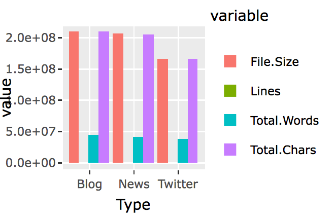
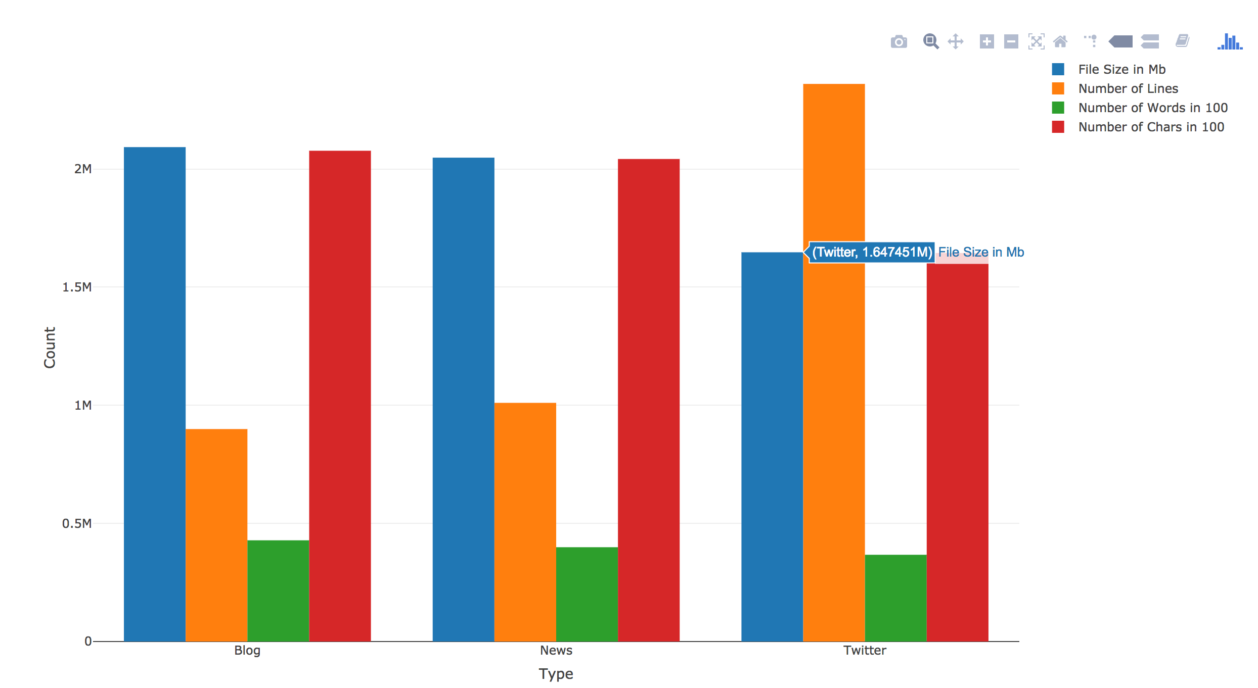
Last journal talked about how to get general txt files features such as size, line, word and char counts. This journal will record my learning journey of ploting the features. See below:
> textStats

Type File.Size Lines Total.Words Total.Chars
1 Blog 209260816 899288 42840147 207723792

2 News 204801736 1010242 39918314 204233400

3 Twitter 164745064 2360148 36719645 164456178
I have used ggplot2() and plotly() before, but it has been several months. Plus I wasn’t an expert back then for both of them. So this time it took me quite a few hours to figure out the right way to do it.
I first started charing with ggplot2(). Soon I found that normal ggplot2() bar chart wouldn’t let me chart all four features for the three types of files side by side. I searched around, and found people say that, in order to create bar chart side by side using ggplot2(), you will first have to use reshape() to switch the data.frame’s rows and columns, and add a new column called “id.vars,” I realized this was what I have learned in the previous Coursera courses after reading this. So here it is the try;
library(reshape2)
textStats_1<-melt(textStats,id.vars = ‘Type’)
and here is the new data.frame:
> textStats_1

Type variable value

1 Blog File.Size 209260816

2 News File.Size 204801736

3 Twitter File.Size 164745064

4 Blog Lines 899288

5 News Lines 1010242

6 Twitter Lines 2360148

7 Blog Total.Words 42840147

8 News Total.Words 39918314

9 Twitter Total.Words 36719645

10 Blog Total.Chars 207723792

11 News Total.Chars 204233400

12 Twitter Total.Chars 164456178
Then plot:
library(ggplot2)
q<-ggplot(textStats_1, aes(x=Type, y=value, fill=variable)) +

geom_bar(stat='identity', position='dodge')
q
Now I realize that I need to find a way to have file size, word counts and char counts shown as 100s or 1000s. I am sure ggplot2() has someway to do this, however, a quick google search didn’t yield any immediate solution. I knew that I had seen something like this in plotly(). So I switched to Plotly().
And here it is:
library(plotly)

p <- plot_ly(textStats, x = ~Type, y = ~File.Size/100, type = 'bar', name = 'File Size in 100Mb') %>%

add_trace(y = ~Lines, name = 'Number of Lines') %>%

add_trace(y = ~Total.Words/100, name = 'Number of Words in 100') %>%

add_trace(y = ~Total.Chars/100, name = 'Number of Chars in 100') %>%

layout(yaxis = list(title = 'Count'), barmode = 'group')
p
There was no need to “reshape()”. Plus you can directly calculate within the plot. Also it has this built-in hover over text function. I know right now the hover over text label width is too short. I should change it to be wrap or longer, but I will save it for another day. Right now my goal is to finish this assignment.


