Tag: R

  • How I Developed a Next Word Prediction App for My Capstone Project

    How I Developed a Next Word Prediction App for My Capstone Project

    Last month, on Sept 10th, I finally finished the Capstone project for the tenth course of the Coursera Data Science Specialization. I had been staying up for more than four nights in a row, the latest to the second day at 5:30 am. I don’t remember when was last time I had done this since I graduated from my Ph.D. study.

    I remember fighting one after another challenges during this project. For so many times, I felt that I might just not have the character to be a data scientist. I had made so many mistakes during the process, yet those were also how I learned. Bit by bit, I kept correcting, tweaking, and improving my program.

    At one point, I thought I had a final product. Then I found that someone on the course forum had provided a benchmark program which can help test how well your app perform. Yet the process to plug in your own program to do the test itself was quite a bit of challenge.

    In the end, I saw a lot of other assignments which didn’t even bother to do it. However, plugging in my app into this benchmark program forced me to compare my app’s performance to others, which in turn forced me to keep improving and debugging.

    At the end, the result was satisfying: I created my own predict the next word app, and I am quite satisfied in comparison to the peers’ works that I have seen during the peer assignment reviewing:

    https://maggiehu.shinyapps.io/NextWords/

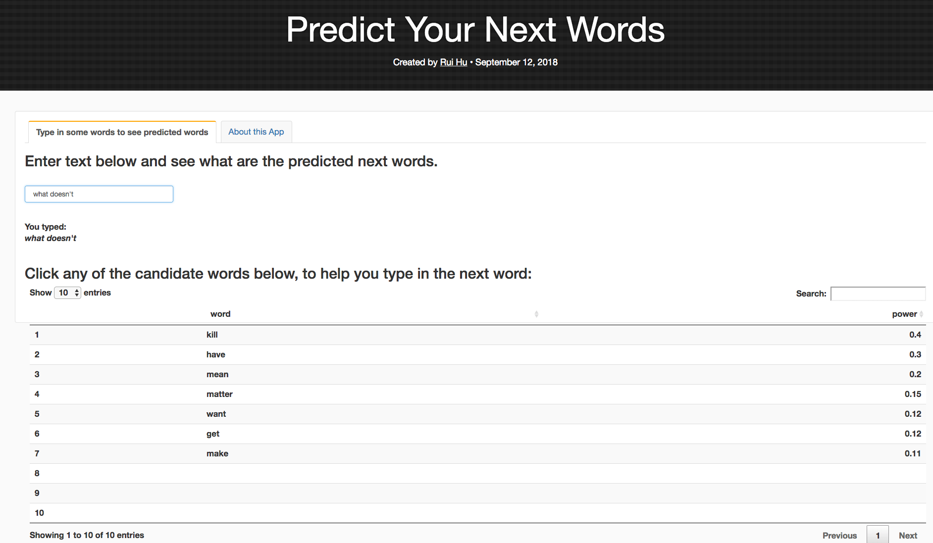
    My app provides not only the top candidates for next word prediction, but also provides the weight of each candidate, using the Stupid Backoff method. I also tried to model after the cellphone text type prediction function, which allows the user to click on the preferred candidate to auto-fill the text box. Below is a screenshot of the predicted top candidate words, when you type in “what doesn’t” in the text box.

    And here is the accompanied R presentation (The R Studio Presenter program implements very clumsy CSS styles which took me additional two hours, after the long marathon of debugging and tweaking the app itself. So I really wish that the course had not had this specific requirement of using R Studio Presenter for the course presentation.

  • Coursera Data Science Specialization Capstone course learning journal 3 – Ploting text file features

    Coursera Data Science Specialization Capstone course learning journal 3 – Ploting text file features

    Last journal talked about how to get general txt files features such as size, line, word and char counts. This journal will record my learning journey of ploting the features. See below:

    > textStats
    Type File.Size Lines Total.Words Total.Chars

    1 Blog 209260816 899288 42840147 207723792
    2 News 204801736 1010242 39918314 204233400
    3 Twitter 164745064 2360148 36719645 164456178

    I have used ggplot2() and plotly() before, but it has been several months. Plus I wasn’t an expert back then for both of them. So this time it took me quite a few hours to figure out the right way to do it.

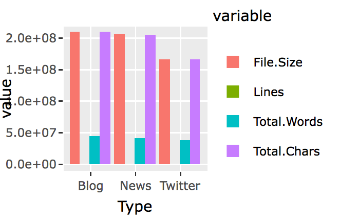
    I first started charing with ggplot2(). Soon I found that normal ggplot2() bar chart wouldn’t let me chart all four features for the three types of files side by side. I searched around, and found people say that, in order to create bar chart side by side using ggplot2(), you will first have to use reshape() to switch the data.frame’s rows and columns, and add a new column called “id.vars,” I realized this was what I have learned in the previous Coursera courses after reading this. So here it is the try;

    library(reshape2)

    textStats_1<-melt(textStats,id.vars = ‘Type’)

    and here is the new data.frame:

    > textStats_1
    Type variable value
    1 Blog File.Size 209260816
    2 News File.Size 204801736
    3 Twitter File.Size 164745064
    4 Blog Lines 899288
    5 News Lines 1010242
    6 Twitter Lines 2360148
    7 Blog Total.Words 42840147
    8 News Total.Words 39918314
    9 Twitter Total.Words 36719645
    10 Blog Total.Chars 207723792
    11 News Total.Chars 204233400
    12 Twitter Total.Chars 164456178

    Then plot:

    library(ggplot2)

    q<-ggplot(textStats_1, aes(x=Type, y=value, fill=variable)) +
    geom_bar(stat='identity', position='dodge')

    q


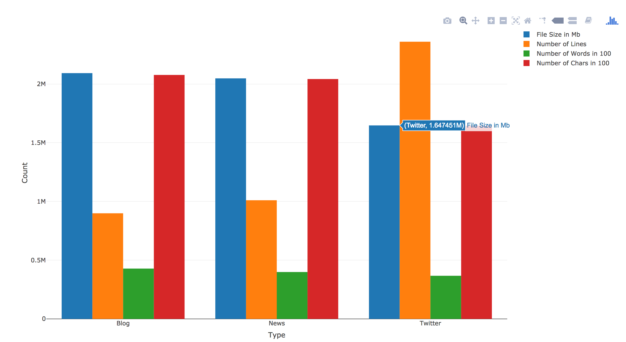
    Now I realize that I need to find a way to have file size, word counts and char counts shown as 100s or 1000s. I am sure ggplot2() has someway to do this, however, a quick google search didn’t yield any immediate solution. I knew that I had seen something like this in plotly(). So I switched to Plotly().

    And here it is:

    library(plotly)
    p <- plot_ly(textStats, x = ~Type, y = ~File.Size/100, type = 'bar', name = 'File Size in 100Mb') %>%
    add_trace(y = ~Lines, name = 'Number of Lines') %>%
    add_trace(y = ~Total.Words/100, name = 'Number of Words in 100') %>%
    add_trace(y = ~Total.Chars/100, name = 'Number of Chars in 100') %>%
    layout(yaxis = list(title = 'Count'), barmode = 'group')

    p

    There was no need to “reshape()”. Plus you can directly calculate within the plot. Also it has this built-in hover over text function. I know right now the hover over text label width is too short. I should change it to be wrap or longer, but I will save it for another day. Right now my goal is to finish this assignment.

  • Coursera Data Science Specialization Capstone Project – thoughts

    Coursera Data Science Specialization Capstone Project – thoughts

    Finally, I am at the capstone project — after three years of on and off working on this coursera specialization, I am finally here.

    The project is to give you a set of text documents, asking you to mine the texts, and come up your own model. So far, I am on week 2. I haven’t dived into the project deep enough yet, so don’t know how exactly I am going to mine the texts, and what kind of model I will be using. But since I was working on preparing for our 3-minute presentation of “what is your passion” last week, for our Monday team retreat at Leadercast, I came across the Maslow’s Needs Hierarchy. I think it would be neat to look at words in each level of the hierarchy, and see how frequent people use words in each hierarchy in their daily blog posts, tweets, and news.

    Maslow's Hierarchy

    To do this, I need to:

    1. Obtain a dictionary and have all words categorized into Maslow’s hierarchy
    2. Run all words in the files against the dictionary to determine which hierarchy they belong to.
      1. Calculate the frequency of each unique word
      2. Calculate the frequency of each level
    3. It would be fun to look at the frequency of each level in general; then look at the correlations between each level.
  • R Plotly Example

    R Plotly Example

    Finishing up reviewing  Coursera Course Developing Data Products week 2 peer assignment, I saw this peer’s work and was impressed. Compared to this work, mine was minimum, even I got full score.
    In the future when there is chance, I will try to create something like this for my work.

    http://rpubs.com/ArtemYan/Eruptions_Map