Category: Data

  • Google Chart – Easy Tool to Create Interactive Chart

    Google Chart – Easy Tool to Create Interactive Chart

    Google tools have proved yet another time that how powerful and easy to use they are: after trying several different open source javascript chat tools, I found Google has a library called Google Charts, which can be easily modified and integrated to your own html.

    Follow instruction on this page to get a quick start and build upon your own charts.

    One notable point is that Google chat’s bar charts are all horizontal. If you want to create vertical bar charts, then you will want to choose “column charts” instead of “bar charts.”

    Another small thing that is probably common sense for programmers but may not be known for people like me is that: be careful to include special symbols such as the single quotation mark ‘  in your text area when you create the chart. Javascript would consider things after it being non-texts therefore won’t render the chart. For example, this chunk of code will stop the chart from rendering:

    var options = {'title':'Rui's First Google Chart',
                           'width':400,
                           'height':300};

    While this would be fine:

    var options = {'title':'My First Google Chart',
                           'width':400,
                           'height':300};
  • Interactive Data Visualization – Interactive Charts

    Interactive Data Visualization – Interactive Charts

    One task of my recent work requires me to design this series of stackable charts and make them visually interesting. An easy way to go is to put colored blocks in Articulate Storyline proportionally and make them appear, enlarge, disappear, and relate. But I think a fun way to do it is to use a JS library to realize it. I haven’t done much (if any) interactive data visualization at this point, except for a few data visualization projects from the Coursera course I took before, using R Shiny, Shiny Gadgets, and googleVis packages.
    So I am starting new exploration now.
    So far, here are the websites that I found interesting/useful:
    Anychart:

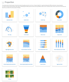
    https://www.anychart.com/chartopedia/usage/chart-to-show-proportion/

    I like this website since it provides source and real time results. Cons: the colorplatte they use is not very attractive. Although this can be changed within their CSS style sheet.


    A showcase from framJS:

    http://share.framerjs.com/z0ctpyo8u71w/

    It seems to have no data connected but have this cool magnifying effect when hover over. Pretty cool.