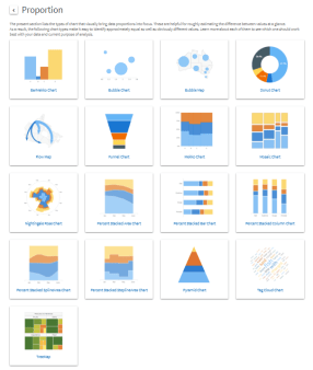
One task of my recent work requires me to design this series of stackable charts and make them visually interesting. An easy way to go is to put colored blocks in Articulate Storyline proportionally and make them appear, enlarge, disappear, and relate. But I think a fun way to do it is to use a JS library to realize it. I haven’t done much (if any) interactive data visualization at this point, except for a few data visualization projects from the Coursera course I took before, using R Shiny, Shiny Gadgets, and googleVis packages.
So I am starting new exploration now.
So far, here are the websites that I found interesting/useful:
Anychart:
 https://www.anychart.com/chartopedia/usage/chart-to-show-proportion/
I like this website since it provides source and real time results. Cons: the colorplatte they use is not very attractive. Although this can be changed within their CSS style sheet.
A showcase from framJS:
http://share.framerjs.com/z0ctpyo8u71w/
It seems to have no data connected but have this cool magnifying effect when hover over. Pretty cool.

