Category: Data Visualization

  • Coursera Data Science Specialization Capstone course learning journal 3 – Ploting text file features

    Coursera Data Science Specialization Capstone course learning journal 3 – Ploting text file features

    Last journal talked about how to get general txt files features such as size, line, word and char counts. This journal will record my learning journey of ploting the features. See below:

    > textStats
    Type File.Size Lines Total.Words Total.Chars

    1 Blog 209260816 899288 42840147 207723792
    2 News 204801736 1010242 39918314 204233400
    3 Twitter 164745064 2360148 36719645 164456178

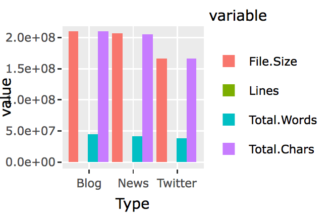
    I have used ggplot2() and plotly() before, but it has been several months. Plus I wasn’t an expert back then for both of them. So this time it took me quite a few hours to figure out the right way to do it.

    I first started charing with ggplot2(). Soon I found that normal ggplot2() bar chart wouldn’t let me chart all four features for the three types of files side by side. I searched around, and found people say that, in order to create bar chart side by side using ggplot2(), you will first have to use reshape() to switch the data.frame’s rows and columns, and add a new column called “id.vars,” I realized this was what I have learned in the previous Coursera courses after reading this. So here it is the try;

    library(reshape2)

    textStats_1<-melt(textStats,id.vars = ‘Type’)

    and here is the new data.frame:

    > textStats_1
    Type variable value
    1 Blog File.Size 209260816
    2 News File.Size 204801736
    3 Twitter File.Size 164745064
    4 Blog Lines 899288
    5 News Lines 1010242
    6 Twitter Lines 2360148
    7 Blog Total.Words 42840147
    8 News Total.Words 39918314
    9 Twitter Total.Words 36719645
    10 Blog Total.Chars 207723792
    11 News Total.Chars 204233400
    12 Twitter Total.Chars 164456178

    Then plot:

    library(ggplot2)

    q<-ggplot(textStats_1, aes(x=Type, y=value, fill=variable)) +
    geom_bar(stat='identity', position='dodge')

    q


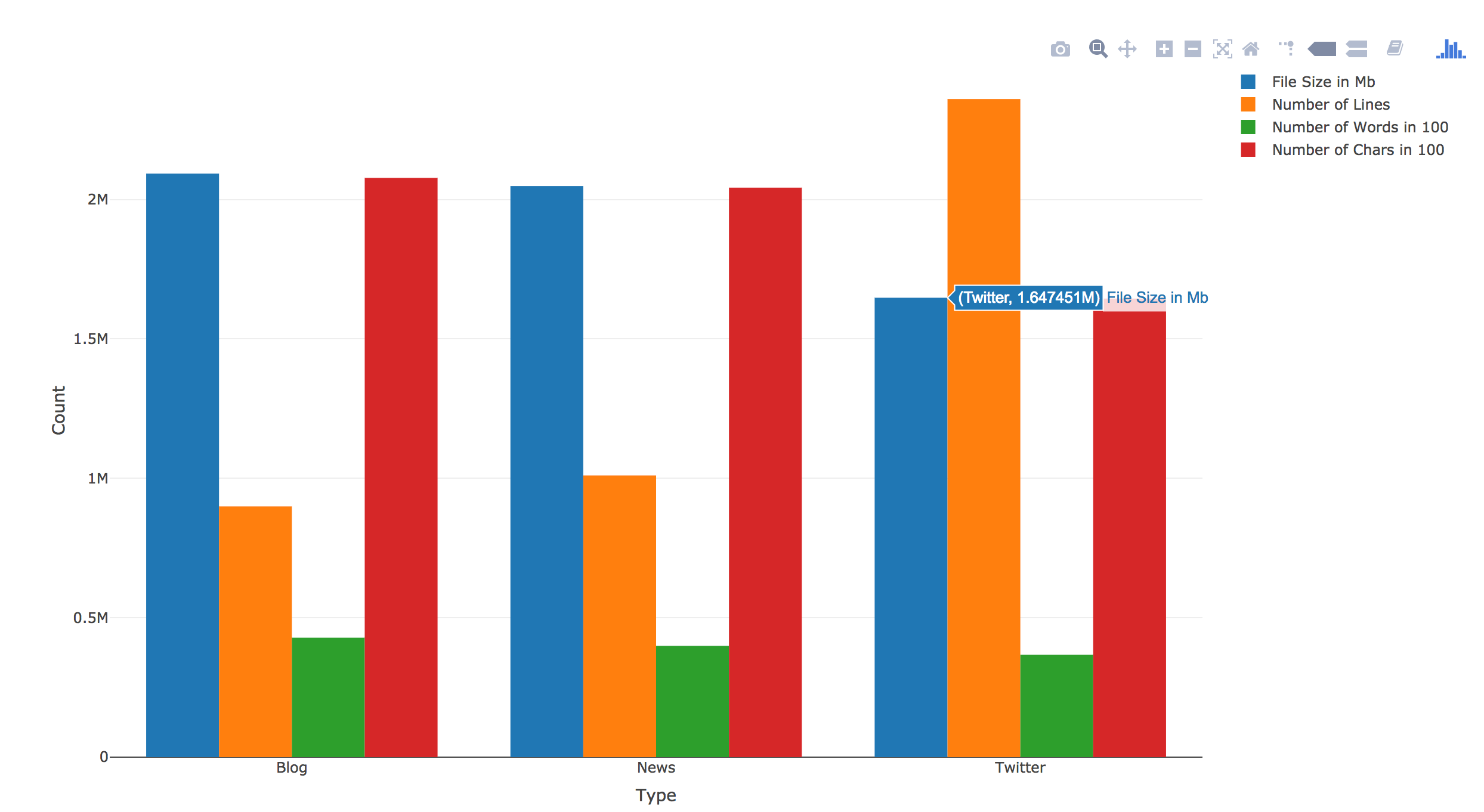
    Now I realize that I need to find a way to have file size, word counts and char counts shown as 100s or 1000s. I am sure ggplot2() has someway to do this, however, a quick google search didn’t yield any immediate solution. I knew that I had seen something like this in plotly(). So I switched to Plotly().

    And here it is:

    library(plotly)
    p <- plot_ly(textStats, x = ~Type, y = ~File.Size/100, type = 'bar', name = 'File Size in 100Mb') %>%
    add_trace(y = ~Lines, name = 'Number of Lines') %>%
    add_trace(y = ~Total.Words/100, name = 'Number of Words in 100') %>%
    add_trace(y = ~Total.Chars/100, name = 'Number of Chars in 100') %>%
    layout(yaxis = list(title = 'Count'), barmode = 'group')

    p

    There was no need to “reshape()”. Plus you can directly calculate within the plot. Also it has this built-in hover over text function. I know right now the hover over text label width is too short. I should change it to be wrap or longer, but I will save it for another day. Right now my goal is to finish this assignment.

  • Coursera Data Science Specialization Capstone Project – thoughts

    Coursera Data Science Specialization Capstone Project – thoughts

    Finally, I am at the capstone project — after three years of on and off working on this coursera specialization, I am finally here.

    The project is to give you a set of text documents, asking you to mine the texts, and come up your own model. So far, I am on week 2. I haven’t dived into the project deep enough yet, so don’t know how exactly I am going to mine the texts, and what kind of model I will be using. But since I was working on preparing for our 3-minute presentation of “what is your passion” last week, for our Monday team retreat at Leadercast, I came across the Maslow’s Needs Hierarchy. I think it would be neat to look at words in each level of the hierarchy, and see how frequent people use words in each hierarchy in their daily blog posts, tweets, and news.

    Maslow's Hierarchy

    To do this, I need to:

    1. Obtain a dictionary and have all words categorized into Maslow’s hierarchy
    2. Run all words in the files against the dictionary to determine which hierarchy they belong to.
      1. Calculate the frequency of each unique word
      2. Calculate the frequency of each level
    3. It would be fun to look at the frequency of each level in general; then look at the correlations between each level.
  • R Plotly Example

    R Plotly Example

    Finishing up reviewing  Coursera Course Developing Data Products week 2 peer assignment, I saw this peer’s work and was impressed. Compared to this work, mine was minimum, even I got full score.
    In the future when there is chance, I will try to create something like this for my work.

    http://rpubs.com/ArtemYan/Eruptions_Map

  • Several things I Learned When Using D3.js to Import and Parse CSV File

    Several things I Learned When Using D3.js to Import and Parse CSV File

    First: what is the best structure for a data?

    CSV or Json, or depends? I read an article claiming that json is much better than csv – will try to find the link later, but right now, the client I am working to develop this visualization for, mainly work with excel spreadsheet, so I guess CSV is the only choice for now.

    Second: how to import and parse csv?

    For this question, I found a very good article here. Following this article’s second approach, I was able to parse the data and change the name of the columns at the same time.

    d3.csv("/data/cities.csv", function(d) {
      return {
        city : d.city,
        state : d.state,
        population : +d.population,
        land_area : +d["land area"]
      };
    }, function(data) {
      console.log(data[0]);
    });

    However, I soon found that the console kept telling me that my dataset was undefined. After googling, I found this stackoverflow answer, which perfectly explained why. Basically, d3.csv is asynchronous. The data you parsed inside of d3.csv will get destroyed once out of the function. So you either include everything you want to do within d3.csv, or you define several functions outside of the d3.csv, then call them from within the function. See below for the genius explanation.

    d3.csv is an asynchronous method. This means that code inside the callback function is run when the data is loaded, but code after and outside the callback function will be run immediately after the request is made, when the data is not yet available. In other words:

    first();
    d3.csv("path/to/file.csv", function(rows) {
      third();
    });
    second();

    If you want to use the data that is loaded by d3.csv, you either need to put that code inside the callback function (where third is, above):

    d3.csv("path/to/file.csv", function(rows) {
      doSomethingWithRows(rows);
    });
    
    function doSomethingWithRows(rows) {
      // do something with rows
    }

    Or, you might save it as a global variable on the window that you can then refer to later:

    var rows;
    
    d3.csv("path/to/file.csv", function(loadedRows) {
      rows = loadedRows;
      doSomethingWithRows();
    });
    
    function doSomethingWithRows() {
      // do something with rows
    }

    If you want, you can also assign the loaded data explicitly to the window object, rather than declaring a variable and then managing two different names:

    d3.csv("path/to/file.csv", function(rows) {
      window.rows = rows;
      doSomethingWithRows();
    });
    
    function doSomethingWithRows() {
      // do something with rows
    }

    Third: Why wouldn’t it work?

    Specifically, why would my numbers turn into “NaN” after using the +d approach? I was first able to import and parse the data into arrays, but of course all numbers were the type of strings with quote marks around them. So I used “+” to convert them. However, then I found in console that all numbers turned into “NaN.” After searching around, I found this was caused by the excel formatting: the original excel spreadsheet formatted the large numbers with commas for thousands — this caused NaN — I unchecked the formatting within Microsoft Excel. That fixed six of eight of the columns. However, there were still two columns shown as NaN, even after the de-formatting.

    What caused that?

    Looking closer, I found it was caused by one extra space at the end of the names of the first of the two misbehaving columns. I deleted the extra space, then both columns act normally now.

  • D3.JS- the Ultimate Javascript to Go for Data Visulization

    D3.JS- the Ultimate Javascript to Go for Data Visulization

    Alright, it has been 12 days since last time I updated here about my data driven chart creation journey. During the past 12 days, except for the three days of trip to Blueridge mountains with my wonderful husband and two lovely kids, along with my friends and their two pretty daughters, I sat/stood in front of my computer, tried, failed, grind my teeth, and tried again. Finally, here are what I found:

    • Although there are numerous sorts of js libraries allowing you to achieve all kinds of functions: stacked bar chart connected with data, animated charts, mouse hover over, etc… So far it seems that D3.js is the only one that can achieve almost “all functions I want.”
    • Anychart.js library, at the moment of writing this post, does not provide html5 based animation for most types of charts.
    • Google chart does not provide full functioning html5 chart animations.
    • D3 can work with Python — I should try to create a sankey diagram with d3 and R or Python, as my next project.
    • When working with large data, json seems to be more preferable than csv.
    • When drawing with svg, the (0,0) point is at the top left of the canvas. That makes the definition of coordinates and animation a little bit interesting.

    During this learning journey, I also learned to use jsfiddle and console.log with chrome and Firefox. I found Firefox’s console seems to be easier to use than Chrome’s. haha.

    Here is my first successfully run fiddle. What it does is to dynamically showing a growing stacked bar chart from the bottom to top — I know it sounds unnecessary, but this would be embedded into an online tutorial to show finance administrators at the place I work how to understand the structure of organizational budget.

  • Google Chart – Easy Tool to Create Interactive Chart

    Google Chart – Easy Tool to Create Interactive Chart

    Google tools have proved yet another time that how powerful and easy to use they are: after trying several different open source javascript chat tools, I found Google has a library called Google Charts, which can be easily modified and integrated to your own html.

    Follow instruction on this page to get a quick start and build upon your own charts.

    One notable point is that Google chat’s bar charts are all horizontal. If you want to create vertical bar charts, then you will want to choose “column charts” instead of “bar charts.”

    Another small thing that is probably common sense for programmers but may not be known for people like me is that: be careful to include special symbols such as the single quotation mark ‘  in your text area when you create the chart. Javascript would consider things after it being non-texts therefore won’t render the chart. For example, this chunk of code will stop the chart from rendering:

    var options = {'title':'Rui's First Google Chart',
                           'width':400,
                           'height':300};

    While this would be fine:

    var options = {'title':'My First Google Chart',
                           'width':400,
                           'height':300};